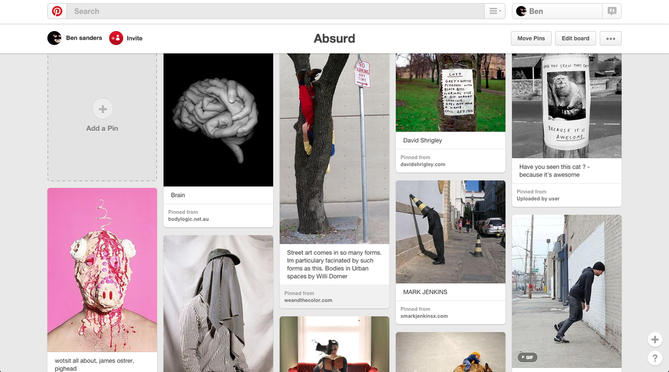
Since we are starting a new topic we have to make a Pinterest of Absurd images to get a good idea of what we can do with a certain type of photography. I think this project is going to be ver interesting and strange since it looks as if there is going to be a lot of crazy photos. I think that for this photoshop will be used a lot since it will help create absurd images giving us the ability to swap heads with body parts etc so I'm looking forward to the experiments of which we are going to try first just to see the out come of my images and to see what I can create .
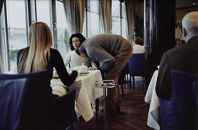
Erwin Wurm
|
This photo from Erwin Wurm which shows a really good example of Absurd. The photo turns a normal day meal into a strange photo with the man with his head in the woman's shirt masking his face from the camera. the setting around them forms the main contrast within absurd photography having everyones responses as a neutral response contrasting what would really happen if someone was to do something like this. I think that Wurm didn't want to include anyone else since it would of distracted everyone from the main focus of the image since him keeping it how he has draws your eyes straight to the main and woman this works well since changing the composition of the image would cause people not to have a focus on the strange contrast Wurm wanted to show.
This photo is very helpful when thinking of what I can do while taking photos trying to make them absurd it shows how easily I can create an Absurd photo. Now when I'm taking photos I can think of this image and see how well Erwin Wurm changed the normal day activity just with one thing and this image has got me brainstorming different ideas for what I can do with this project. |
|
|
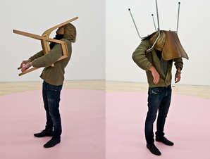
This is also a really good example from Erwin Wurm because this photo shows how I can use everyday objects for an absurd photo instead of changing around an everyday situation. When looking at this I think of how I can make a similar photo but using a different object for example someone could hide their face by balancing something on their heads or faces. I like this image since I think its quite funny the way the persons face and head looks squished against the chair and the way the image looks as a whole make me laugh. I think having the plain setting and background causes the person to stand out more and gives better light to see the image as a whole rather than having a setting out doors although a setting like that would work since it creates two absurd moments within the image the first being the fact the man is out side with a chair on his head in a public place which would be a very strange thing to see and two the fact he has a chair on his head.
|
|
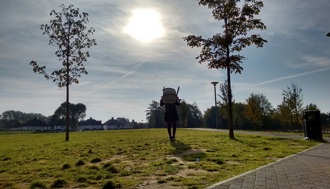
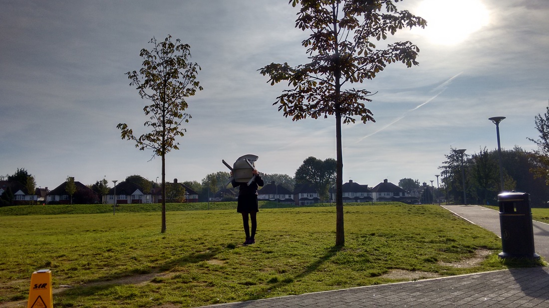
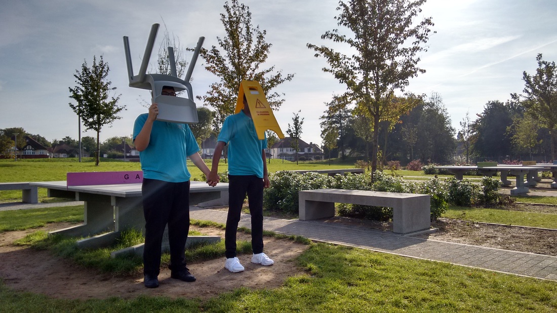
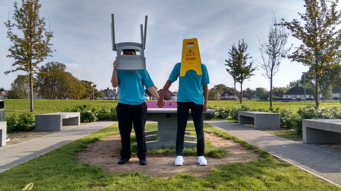
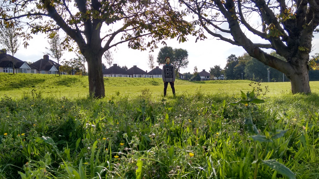
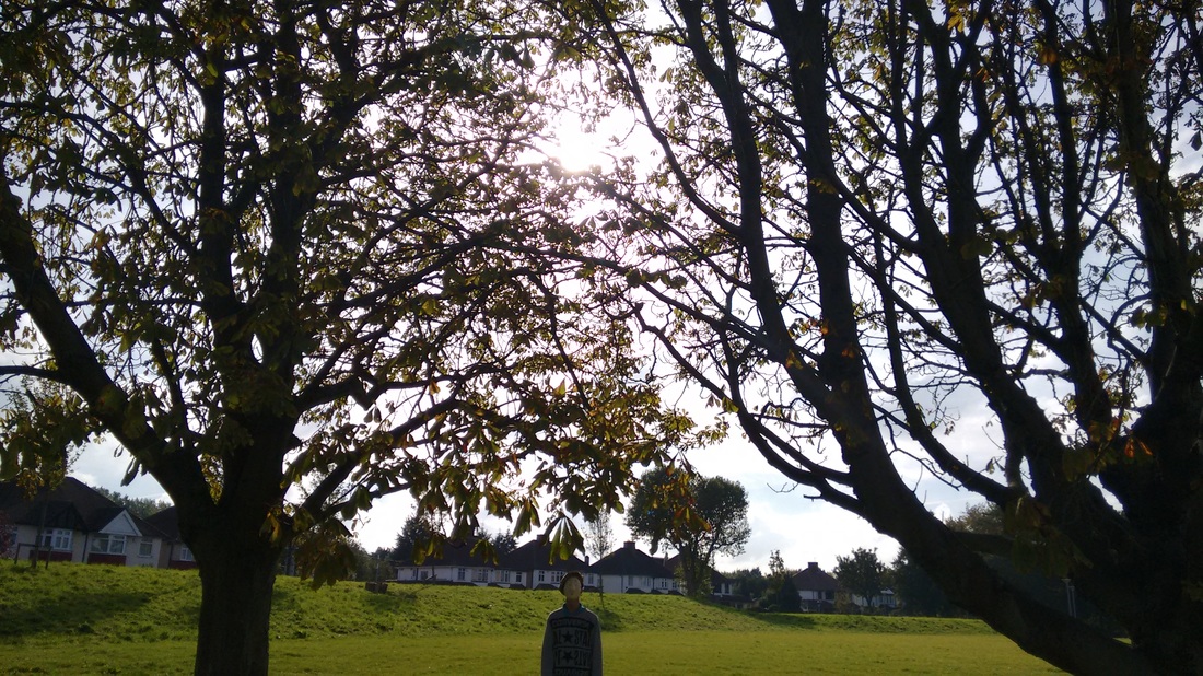
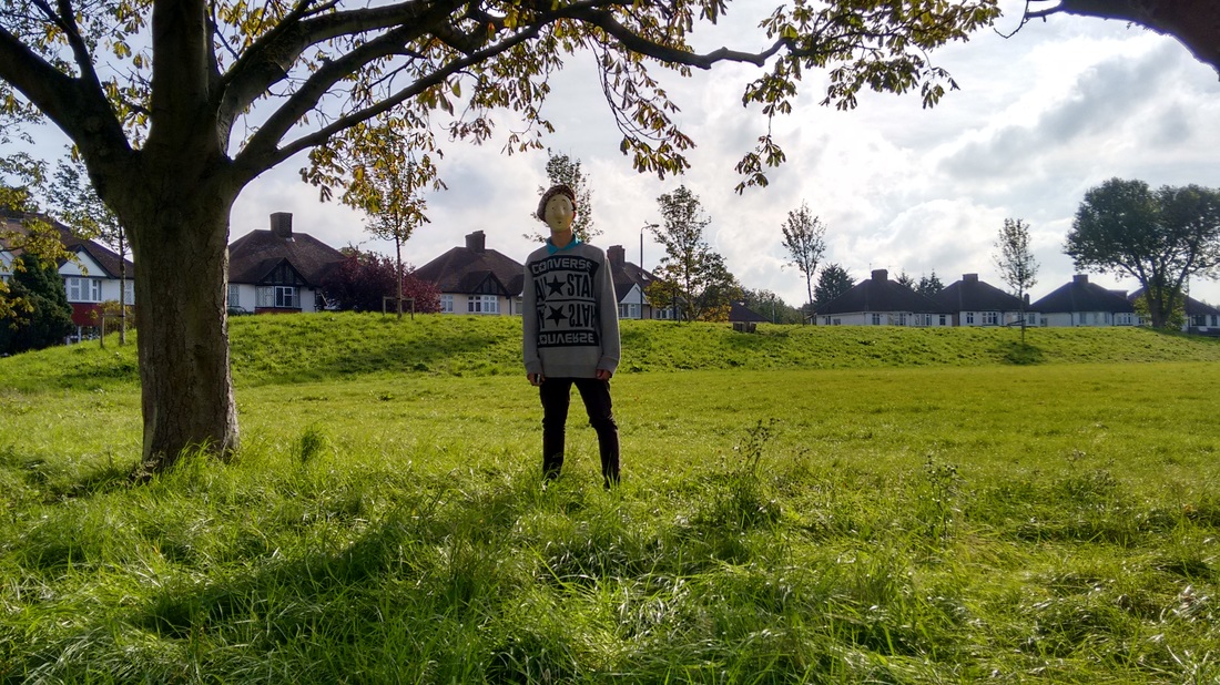
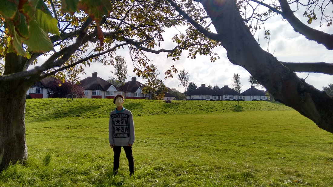
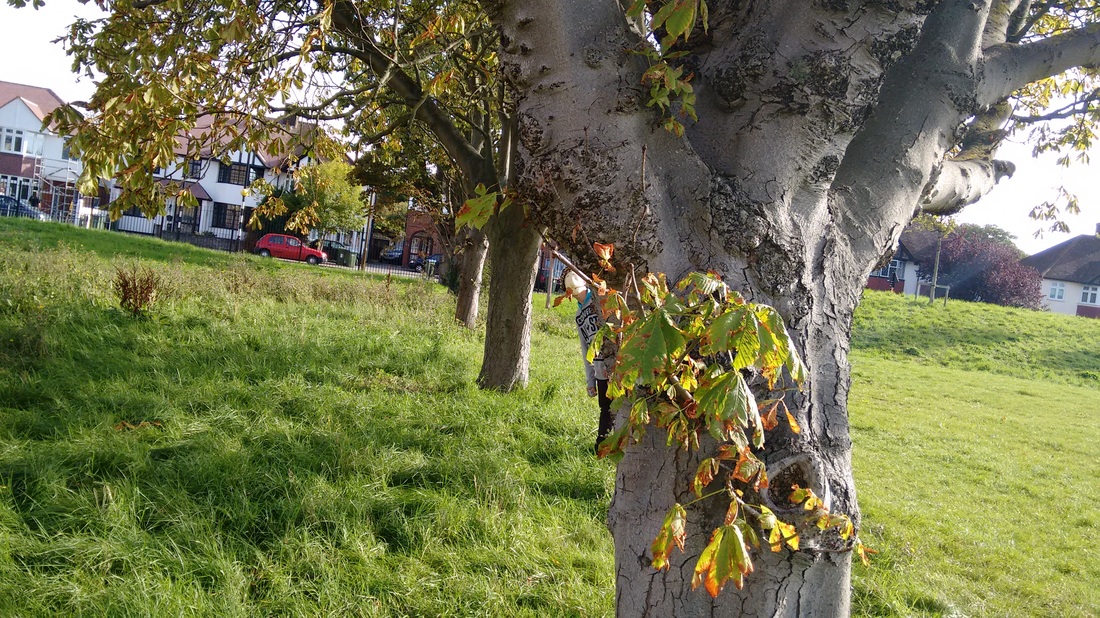
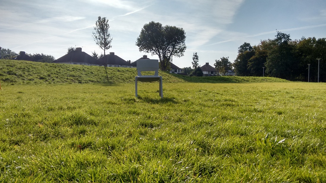
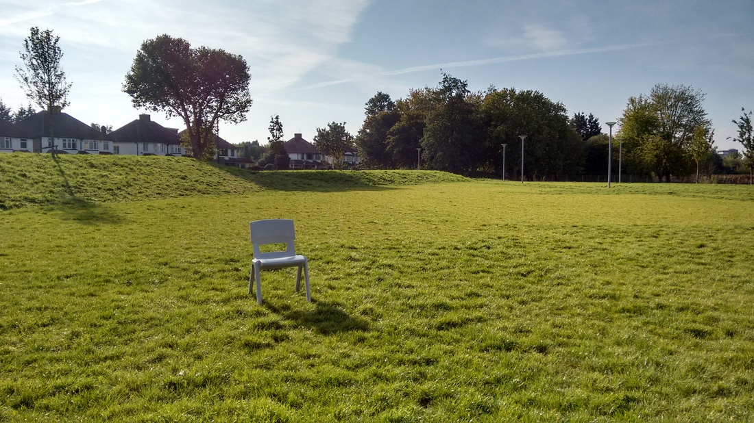
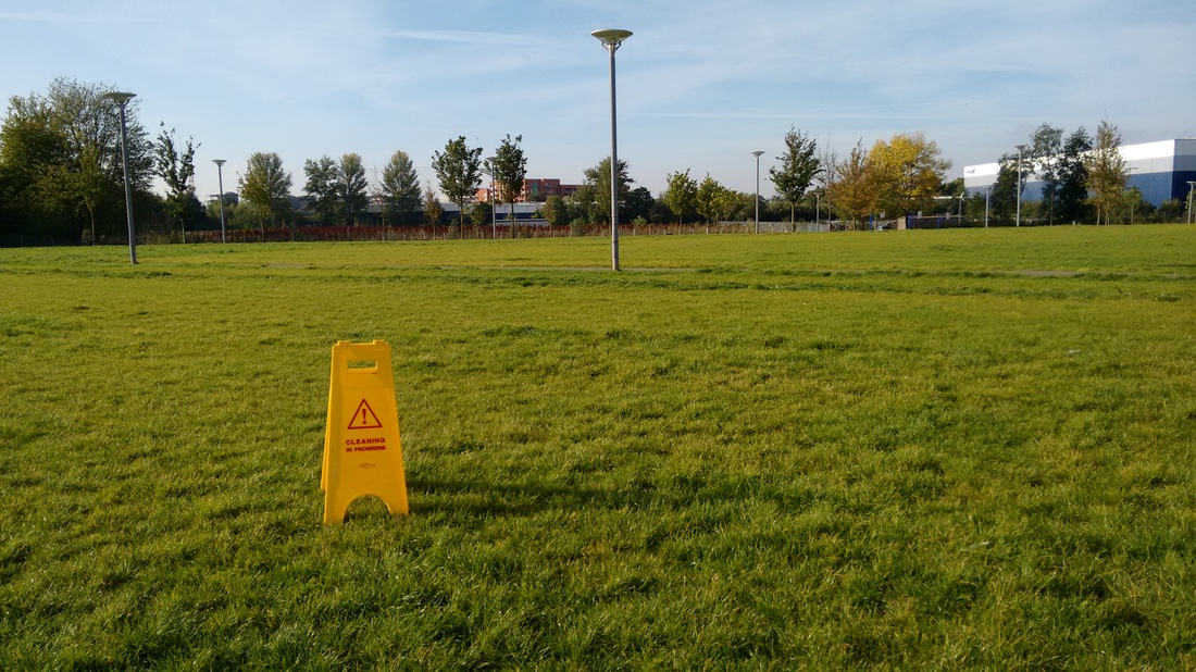
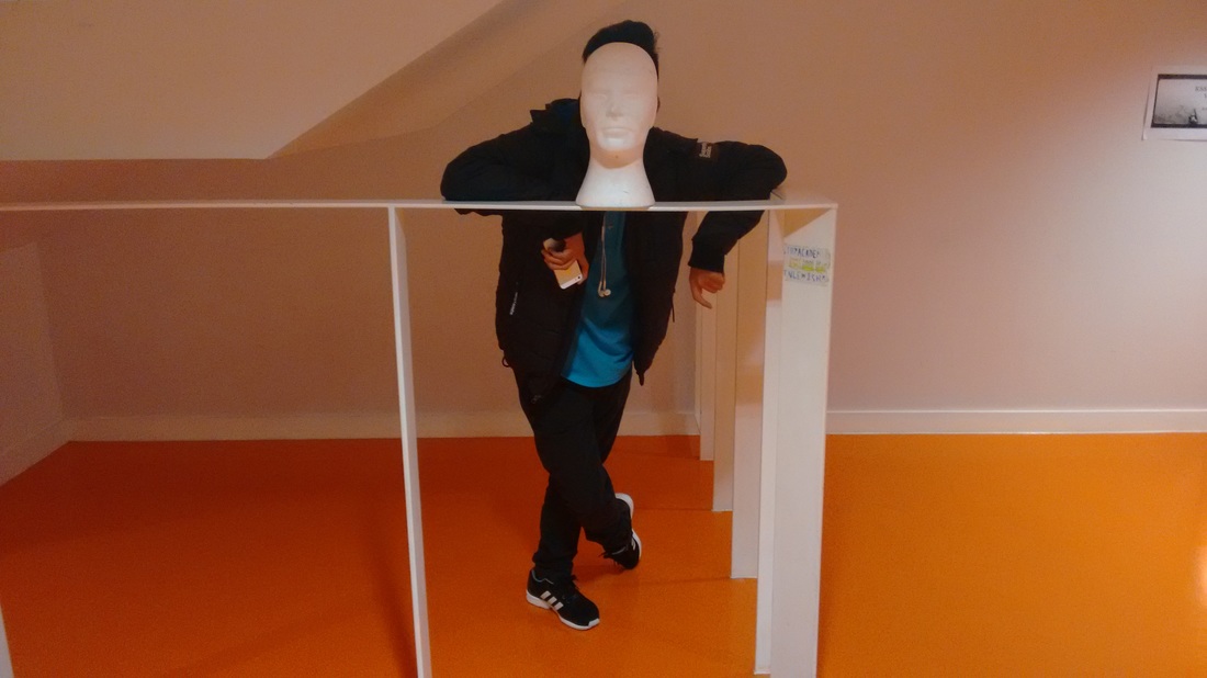
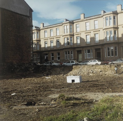
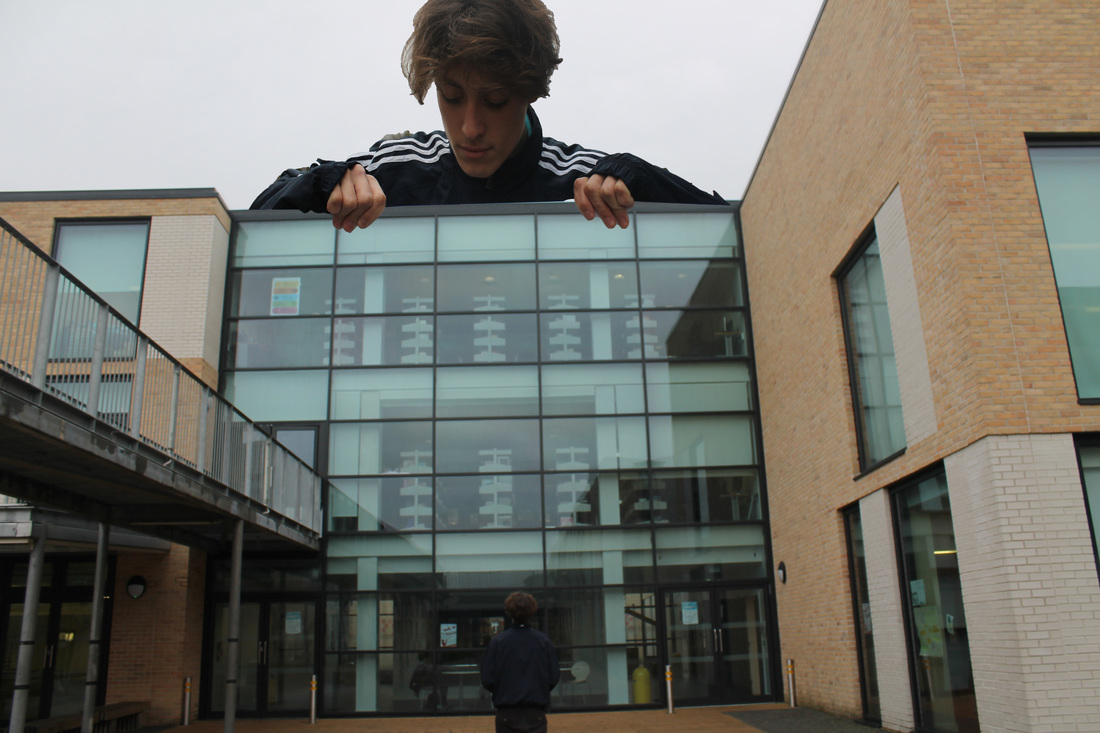
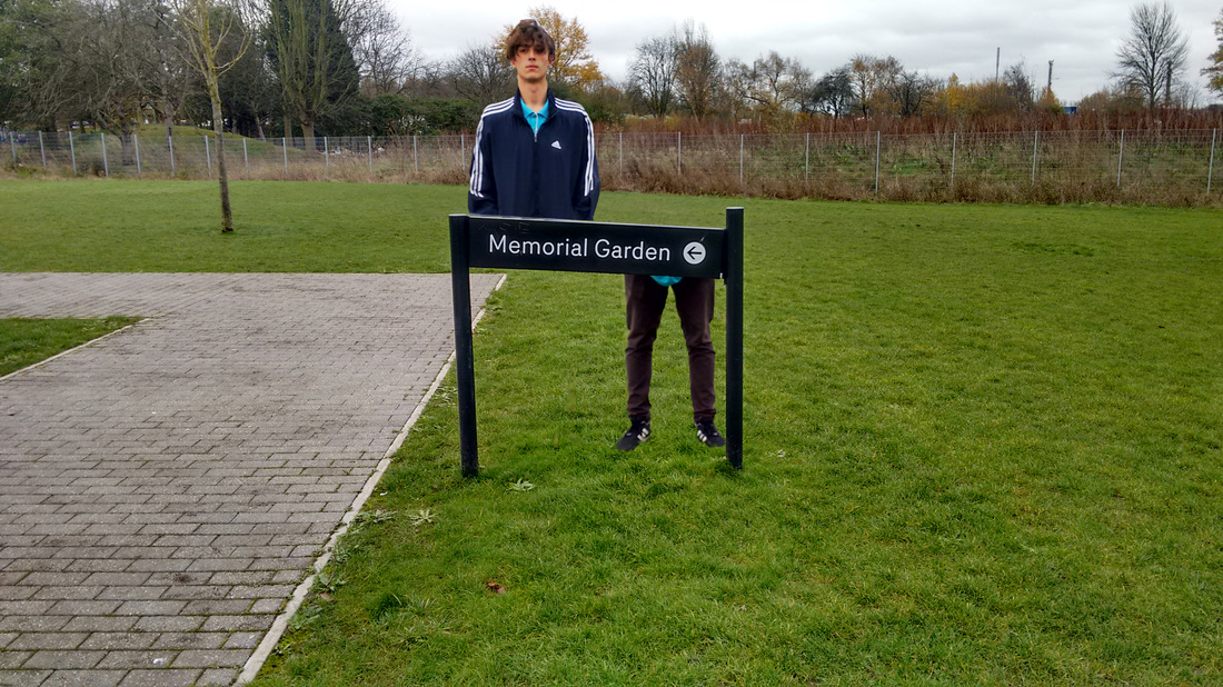
This is my first attempt at absurd photography I mainly focused on the mask work and hidden face within the photos. having the subjects face hidden causes the photo to become strange yet fascinating and once again contrasting a normal situation.I wanted the mask photos to look strange and out of place because of how creepy you can make a person look for example the photo with the subject head poking out from the side of the tree creates a very weird feeling and atmosphere .The photos with the chair and sign where not as strange but just had a different look from a normal photo since its something that is rather out of the ordinary and just doesn't look right because of the fact there is a wet floor sign and a chair in the middle of a field.
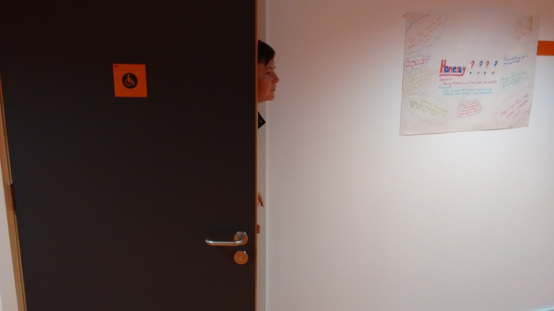
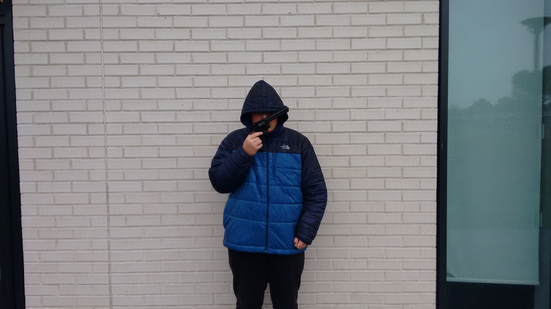
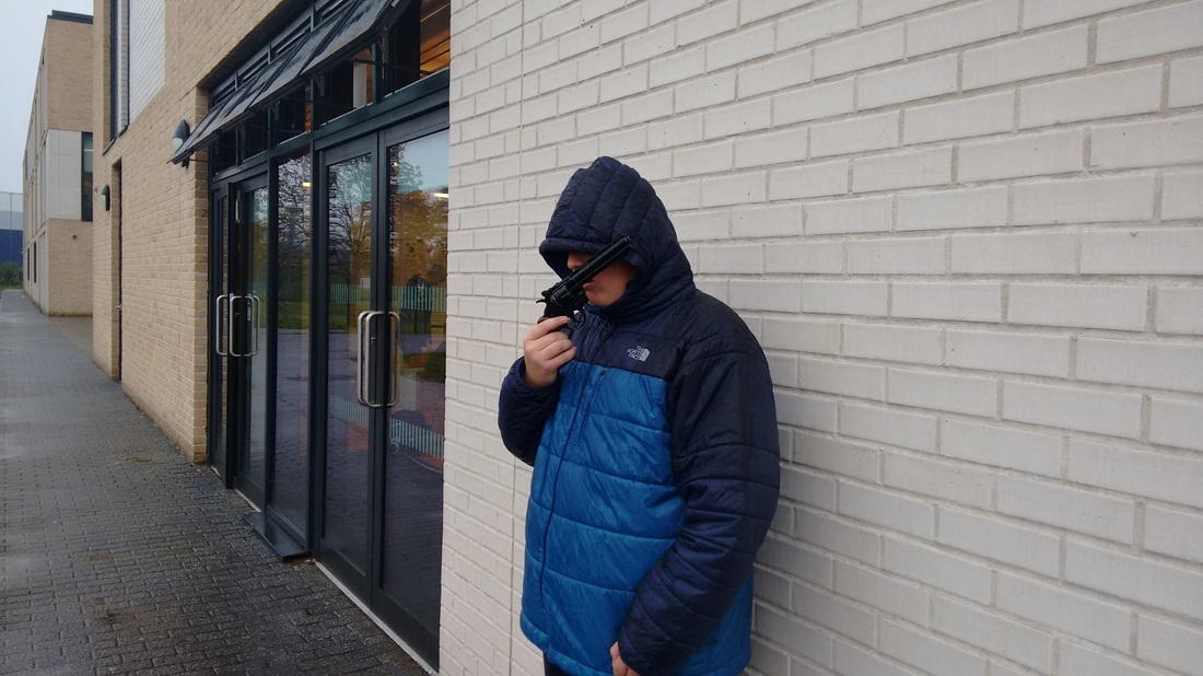

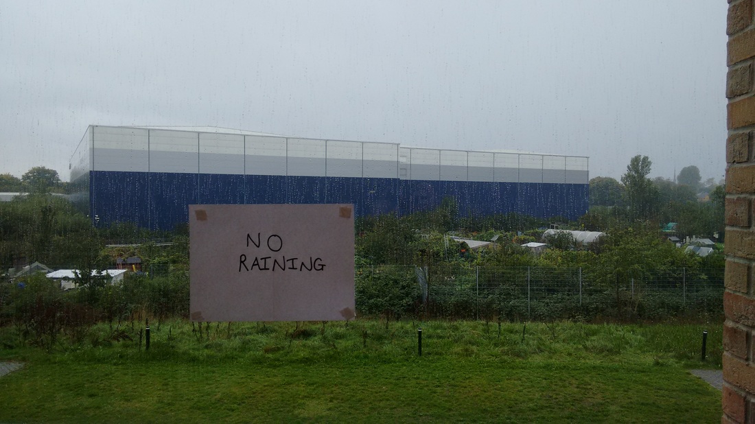
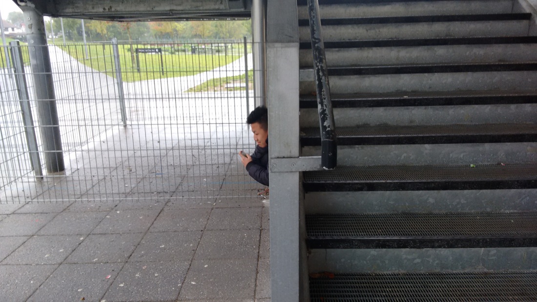
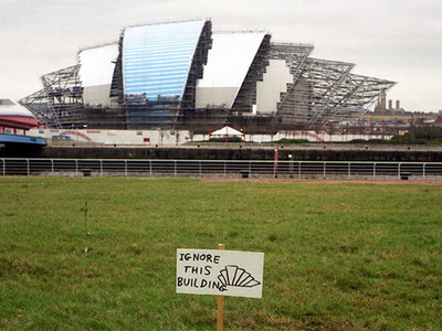
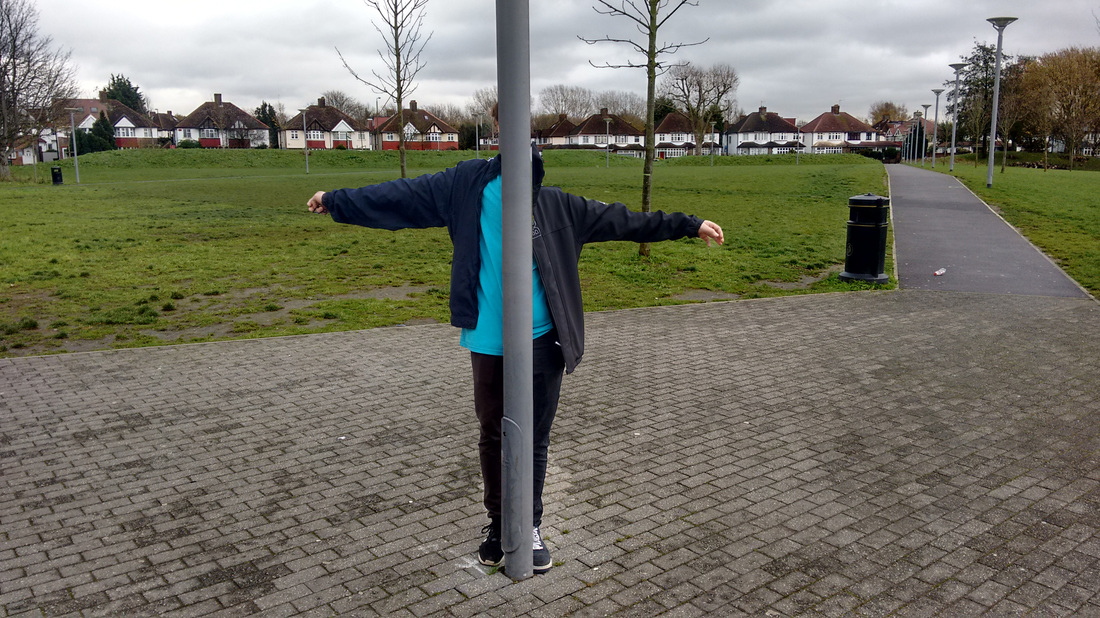
In this second set I wanted to play around with different looks of absurd just having a whole different look compared to the first set of images I went for a more hidden in plain sight look having people under stairs and behind fake heads and behind simple objects like the prop gun that was used. I also tried a sign photograph but I don't think this photo worked well since you cant see the rain in the background that much and most likely would have worked better if rain was shown within the background of the image
|
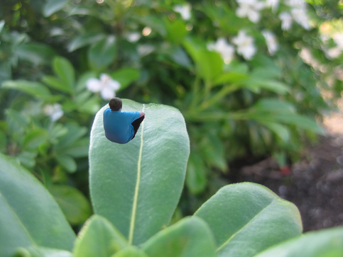
I got the idea for this photo when i was looking on Pinterest and i saw a photo about different photo ideas and i saw a similar picture to this and thought that it worked well with the whole idea of absurd photography. I think i could of done a better job with the photo shop so I'm keeping this as a reminder for when i next use photoshop, things to look for when using photoshop are light texture and composition matching up how light looks in a photo is key since it will make the image look bad and unrealistic even if the photo is as a person sitting on a leaf. texture is also important since the object in the image needs to look as smooth as the background image so that the photo looks a tiny bit more natural. composition is important as well since the images need to match up for example with my two images I had to take them at a similar angle so that the photos line up and don't look odd and too obvious. when using photoshop I need to remember these things. in the image I have thought about composition and light to get the light to match up I took the photo of my friend ed in front of a window so that light hits the front of hime like light hist the front of the leaf more than the back.
|
David Shrigley
|
|
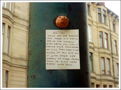
This set of images are from David Shrigley a Scottish photographer who uses signs through out most of his absurd photography he uses simple yet funny signs to create really good photographs. Shrigley has continuously thought about composition when taking his photos because in every photograph of his I have looked at he makes sure that there is no one within the shot who takes your attention away from the main subject of the image. looking at his images and signs it gives me plenty of ideas for signs that are different to many ideas that other people are coming up with for example many people in my class are using post it notes or warning signs but David Shrigley shows how you can use a signs in a very different way and this helps me think of different things such as missing signs or wanted posters with their own unique approach. So when it comes to me taking my first proper set of images I know to make sure my shot is clear and the many different combinations of signs and posters I can make for my pictures
|
This is my first attempt at making signs and photographing them, I don't think that the images worked so well since they would have looked better if it would of been better since you can't see the small writing but I wanted to show most of the surroundings as a part of the image to create a normal atmosphere that contrasts to the sign and what it means but was quite hard to show because of the small text. So next time I know to have bigger writing or to chose a different background that what I have used and also to make sure that the back and foreground contrast each other so that it create an absurd image.
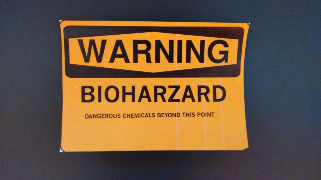
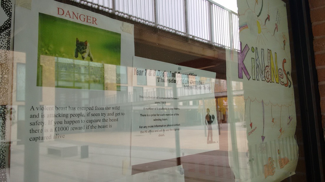
I decided to take another photograph of the kitten poster because I wanted it so that people could actually read what was on the poster so that they will understand the comedic side of the image and poster. The main use of the word danger is when you really are in danger but i thought to myself instead of having a dangerous animal on the poster in a normal school setting I thought about having something harmless made out to be something like a lion or wild animal, I added the reward to make it seem as if it was like a bounty put upon someone but having this could create a whole separate image by putting a bounty on something like a pigeon or anything else that is harmless.
I decided to take another photograph of the kitten poster because I wanted it so that people could actually read what was on the poster so that they will understand the comedic side of the image and poster. The main use of the word danger is when you really are in danger but i thought to myself instead of having a dangerous animal on the poster in a normal school setting I thought about having something harmless made out to be something like a lion or wild animal, I added the reward to make it seem as if it was like a bounty put upon someone but having this could create a whole separate image by putting a bounty on something like a pigeon or anything else that is harmless.
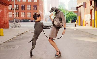
Michael Hughes
|
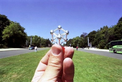
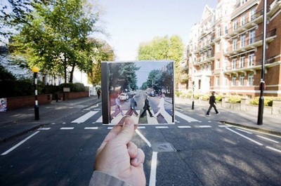
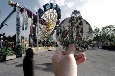
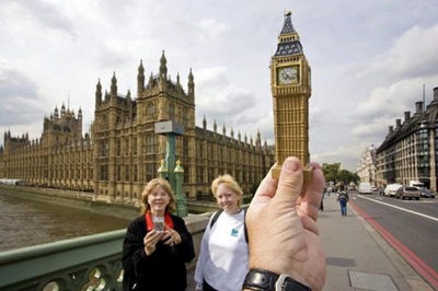
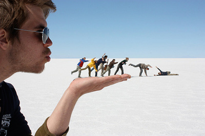
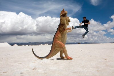
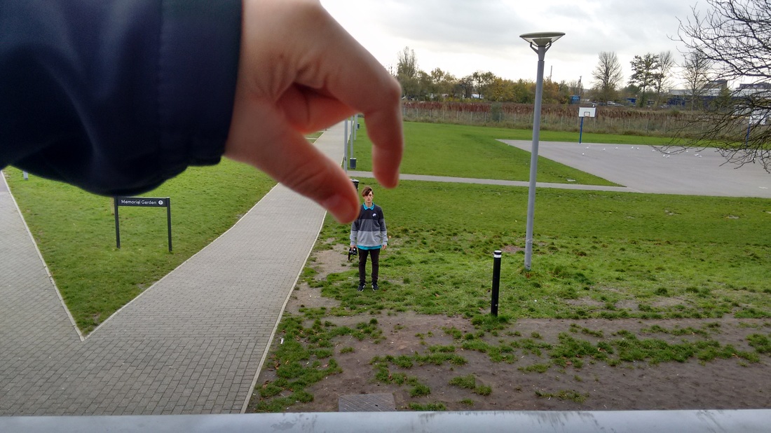
these images where taken by Michael Hughes a photographer who uses a lot of forced perspective and has found a way in which he uses it really well to create an image that uses forced perspective i could start with a simple photograph by having one person standing in the distance and another close to the camera who looks as if they are holding the person in their hand. I can then go on to develop the image to create one similar to one of Hughes for example the clock tower i could easily do with a different building for example the shard in London I can easily buy a cheap small model from a gift shop and try this myself and recreating albums covers that are around London would also be a good idea so one day on the weekend is a day fro me to try these ideas I will base on Michael Hughes photography
|
|
Forced Perspective
|
|
Forced perspective is a style which is used by many people around the world mainly by tourists messing around, but when thought about Forced perspective can be used to create a very interesting and unique photograph. Although I couldn't find many photographers online the images within the slideshow were obviously thought out and planned by the person who took the photograph which are perfect examples for how it can be used to create a unique photograph. looking at these images I get many ideas on what I can do with my images and how I can play around with Forced perspective.
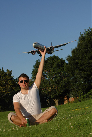
I didn't research any photographers since I didn't come across any but a photographer that I know has used forced perspective is Michael Hughes who I have already researched earlier and he is another example for forced perspective, in some images he has used things like model key rings or cup coasters and I can easily use objects like this in my own photography. |
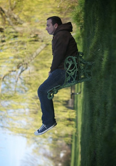

In this set of images I wanted a mix of forced perspective and photoshopped images. I think I could have taken better false perspective images since the one i have taken wasn't placed properly and I could of done different images for example I could of had someone looking as if they are holding someone on their hand. I also need to look at more forced perspective photographers so I can get a better understanding of how to do it and how it is used so I can then put it to use when next taking photographs.
|
This is the photo that I photoshopped it was really easy and simple to adjust since I only had to take a photo with the person in the shot and one without the next step was to cut him out and place him on the empty image which was easy. I done this to give the effect that he was floating away or being sucked into the sky but the effect isn't their as much so I think by adding objects by using photoshop to give the effect that someone or something is sucking him and the objects into the air.
|
|
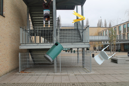
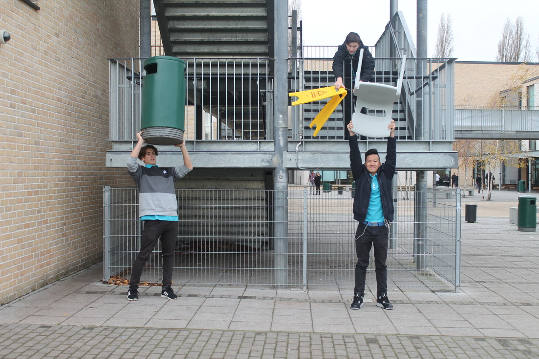
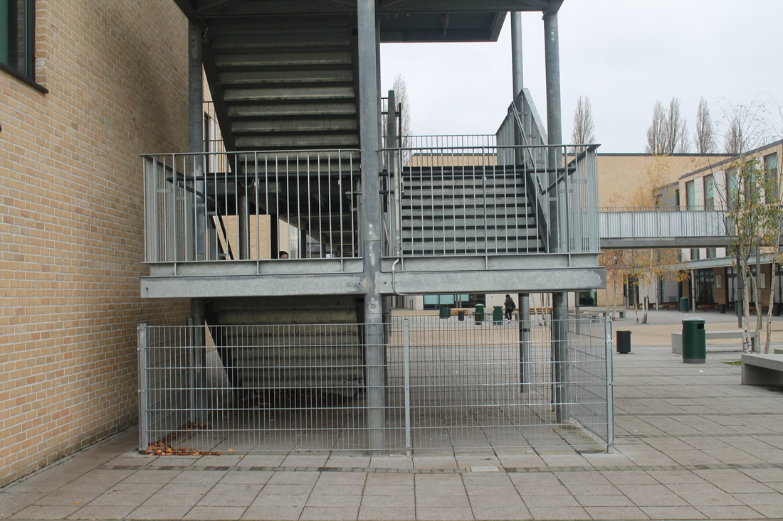
This is my final image after playing around with what I could do I'm happy with the end results and I feel that the image come out a lot better than I thought it would originally. To photoshop the image took a while since I had to change the brightness of the objects so it would match up to the image I also spent a while erasing and correcting the objects for example when erasing certain parts around the bin I found that I had to erase a chunk from the bottom because a hand was in the way to adjust this I used the stamp and smudge tool just to get it to blend together and look a bit more normal, I also ran into the same problem with the chair. I took a while to think about the placement on the objects in the image for example the chair is covering another green bin in the background so the effect of every thing being sucked into the sky stops working, although there were other objects I couldn't erase but looking back at the image I now know that I could have just used the stamp tool to get rid of the object so now I know to do this next time when creating an image like this.
This set of images are once again edited through photoshop. The ideas come from a set of images on Pinterest, I personally prefer the second image since I think it come out better and looks better it was easy to create since all I had to do was take a picture of brandon holding something and looking down so I used a bit of card and photoshopped Brandon out of the picture the second picture I had to take was the building and brandon looking up at himself the whole aspect of a big brandon and a small brandon is abstract itself. The third image I didn't spend a lot of time on and so it didn't look as good as the other two and to make it look a whole lot better if i had changed the brightness and contrast in the floating objects to make them look as if they where more natural.
|
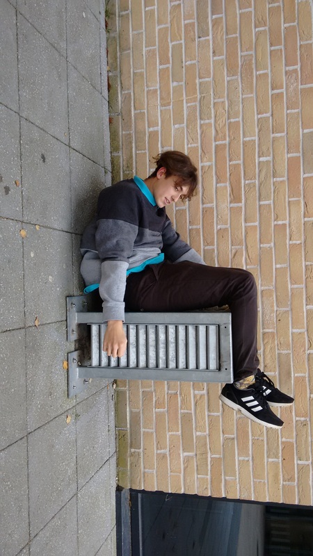
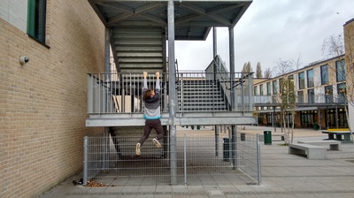
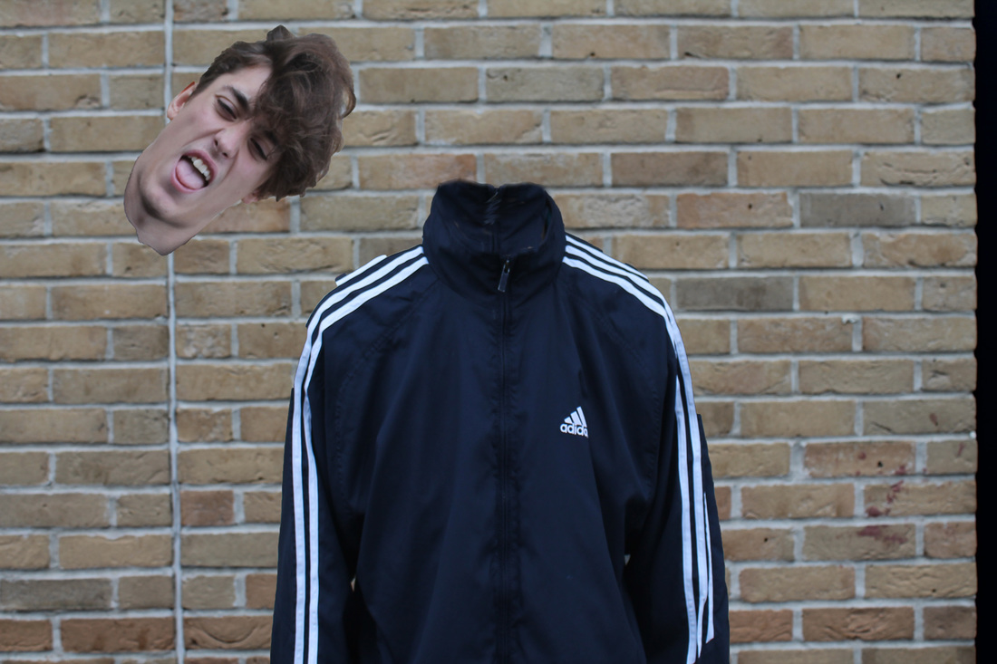
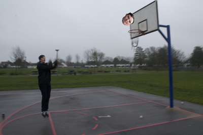
These two images where really easy to make but took me while to think of these ideas as when taking photos in school its quite limited for what you can do. when I thought of the idea for the pole picture I thought about how I could easily change the look of someone and also how I could use hide in the image. For the second I wasn't to sure what I could do with it, at first i flipped him but I didn't think it worked so then I moved his legs and I really like the outcome and so I kept it like that. Compared to the other images these two weren't hard to make for example the pole picture
|
|
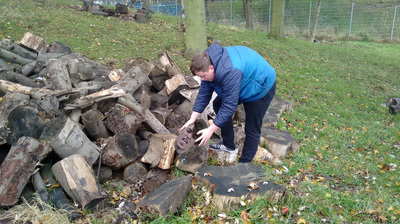
These 3 images where completely off the top of my head and where quick simple photos for the images I had to keep changing the brightness and contrast since I needed to use different images from different days and so the pictures don't match up to well and are noticeable. I think the best one out of the three is the second one where ed is picking up Brandon's head from the logs. I think it the image I done best on with photoshop but also I need to change the brightness and contrast of Brandon's head, I'm most likely going to have this image within my final piece and so I'm going to improve the image so that the photoshop will cause the image to look more natural
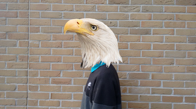
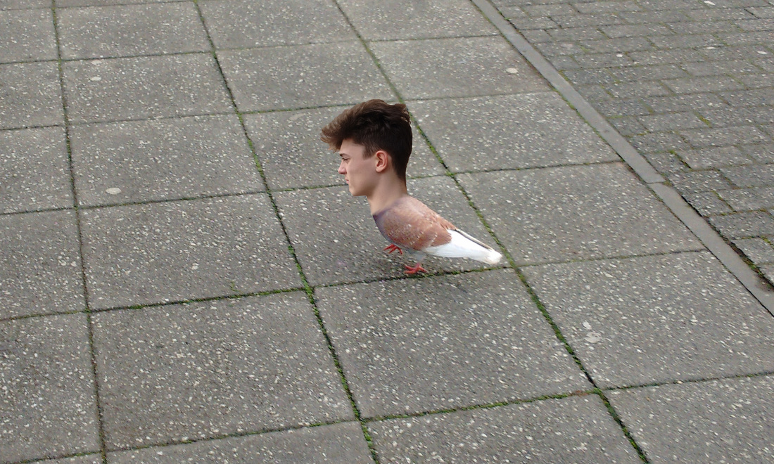
With these images I wanted to change my usual theme this time it being birds I liked the way these images worked together replacing heads with humans and animals and gives me more ideas for images similar to this for example I can now go on to create a photo where heads of humans and dogs are swapped round and changed. I think that this would work well as a final piece so my next step is to do some research and look at photos where peoples and animals heads are replaced and try it for myself.
Getting the heads to match up was quite hard with the image where the persons head is replaced with an eagle's since rubbing out certain areas that i didn't need would reveal the persons face and so I had to use the stamp tool to cover that up i mainly used it on the front of the neck and I'm happy with the results since it doesn't look obvious. To get the persons head on the pigeon wasn't as difficult as the eagle head because the pigeon was a further shot and so the head was rather small but to get the the head look like its actually attached to the pigeon i had to smudge the persons neck so that it look more natural and not like an obvious photoshop.
Getting the heads to match up was quite hard with the image where the persons head is replaced with an eagle's since rubbing out certain areas that i didn't need would reveal the persons face and so I had to use the stamp tool to cover that up i mainly used it on the front of the neck and I'm happy with the results since it doesn't look obvious. To get the persons head on the pigeon wasn't as difficult as the eagle head because the pigeon was a further shot and so the head was rather small but to get the the head look like its actually attached to the pigeon i had to smudge the persons neck so that it look more natural and not like an obvious photoshop.
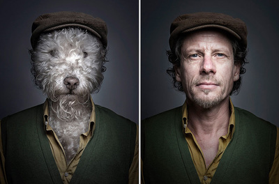
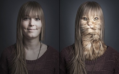
Images like these give me inspiration for what i can do in a studio all I have to do is find pictures of animals or take pictures of my own pets to use for pictures just like these. I think my main focus of style would be the pictures where the dog and cat faces replace the human faces since I like how they are set out and put side by side. To create images similar to these will be a challenge since I'll need to be able to have pictures of dogs looking straight ahead and close enough so that I can have their heads and necks match the heads and necks of humans, The photoshop may be a challenge as well since I'm going to have to spend a lot of time making the head look natural and not so clear that it has been photoshopped
Tonight to help me with the images I'm going to use my dogs to take pictures but so i doesn't seem repetitive I'm going to also be using pictures of other dogs and cats from google images to make the images more interesting. I'm also think about getting dog heads that match the humans personality which will also give the image a interesting view on how similar people and animals can be.
Tonight to help me with the images I'm going to use my dogs to take pictures but so i doesn't seem repetitive I'm going to also be using pictures of other dogs and cats from google images to make the images more interesting. I'm also think about getting dog heads that match the humans personality which will also give the image a interesting view on how similar people and animals can be.
In this slideshow of images are going to be used for my final piece I got the idea after looking at some images on pinterest and thought the whole concept was really cool. There where many stages of photoshop included within these images which lead to very frustrating moments. A main issue was trying to match up the heads properly and so when taking the photos I asked the people to try and sit exactly liek the dogs and try to have their head positioned similar to make it easier this was a major help since I was just able to put the head on top of the image and easily line it up for when I needed to rub certain areas out. I also had to change the sizes of the dogs heads to match up to the normal heads and so I would have to erase peoples hair and ears using the stamp tool so it was just the black background covering. Another difficult phase was erasing stuff around the head i didn't need since it was cause the head to look oddly shaped and so I would spend a lot of time going back and trying to erase it properly or to stamp and smudge certain areas mainly at the neck to hide the normal necks but in the end i was able to create images I'm very happy with.
Another main concern was the brightness of the images I had to keep trying to match it up so the two images would blend more creating a more natural look, but now looking over the images I can see that I could have adjusted it a bit more to match them up and creating a better outcome for the image
Another main concern was the brightness of the images I had to keep trying to match it up so the two images would blend more creating a more natural look, but now looking over the images I can see that I could have adjusted it a bit more to match them up and creating a better outcome for the image
